@semih
Create storyboard grids.
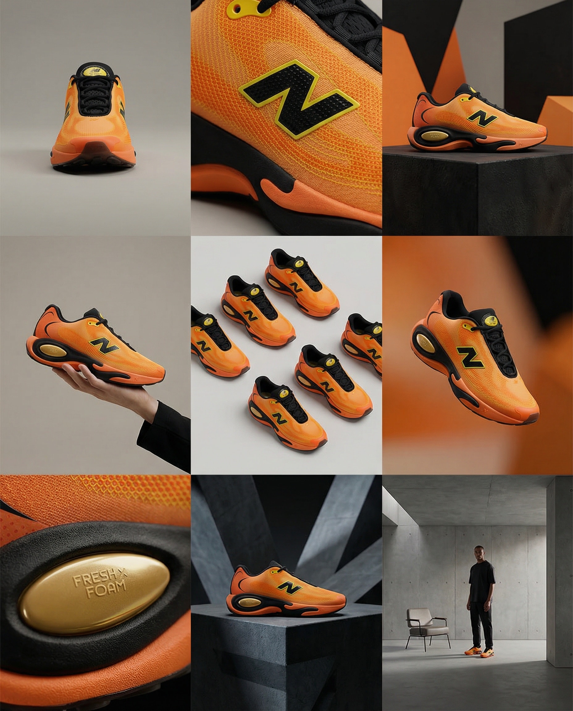
A clean 3×3 [ratio] storyboard grid with nine equal [ratio] sized panels on [4:5] ratio.

Use the reference image as the base product reference. Keep the same product, packaging design, branding, materials, colors, proportions and overall identity across all nine panels exactly as the reference. The product must remain clearly recognizable in every frame. The label, logo and proportions must stay exactly the same.

This storyboard is a high-end designer mockup presentation for a branding portfolio. The focus is on form, composition, materiality and visual rhythm rather than realism or lifestyle narrative. The overall look should feel curated, editorial and design-driven.

FRAME 1:
Front-facing hero shot of the product in a clean studio setup. Neutral background, balanced composition, calm and confident presentation of the product.

FRAME 2:
Close-up shot with the focus centered on the middle of the product. Focusing on surface texture, materials and print details.

FRAME 3:
Shows the reference product placed in an environment that naturally fits the brand and product category. Studio setting inspired by the product design elements and colours.

FRAME 4:
Product shown in use or interaction on a neutral studio background. Hands and interaction elements are minimal and restrained, the look matches the style of the package.

FRAME 5:
Isometric composition showing multiple products arranged in a precise geometric order from the top isometric angle. All products are placed at the same isometric top angle, evenly spaced, clean, structured and graphic.

FRAME 6:
Product levitating slightly tilted on a neutral background that matches the reference image color palette. Floating position is angled and intentional, the product is floating naturally in space.

FRAME 7:
is an extreme close-up focusing on a specific detail of the label, edge, texture or material behavior.

FRAME 8:
The product in an unexpected yet aesthetically strong setting that feels bold, editorial and visually striking.
Unexpected but highly stylized setting. Studio-based, and designer-driven. Bold composition that elevates the brand.

FRAME 9:
Wide composition showing the product in use, placed within a refined designer setup. Clean props, controlled styling, cohesive with the rest of the series.

CAMERA & STYLE:
Ultra high-quality studio imagery with a real camera look. Different camera angles and framings across frames. Controlled depth of field, precise lighting, accurate materials and reflections. Lighting logic, color palette, mood and visual language must remain consistent across all nine panels as one cohesive series.

OUTPUT:
A clean 3×3 grid with no borders, no text, no captions and no watermarks.
Create stunning videos with Remotion.
Minimal Countdown Scene:
Count down from 3 → 2 → 1 using a clean, modern font.
Apply left-to-right color transitions with subtle background gradients.
Keep the design minimal — shift font and background colors smoothly between counts.

Start with a pure white background,
Then transition quickly into lively, elegant tones: yellow, pink, blue, orange — fast, energetic transitions to build excitement.

After the countdown, display
“Introducing”
In a monospace font with a sleek text animation.

Next Scene:
Center the Mitte.ai and Remotion logos on a white background.
Place them side by side — Mitte.ai on the left, Remotion on the right.

First, fade in both logos.
Then animate a vertical line drawing from bottom to top between them.

Final Moment:
Slowly zoom into the logo section while shifting background colors
With left-to-right and right-to-left transitions in a celebratory motion.

Overall Style:
Startup vibes — elegant, creative, modern, and confident.